a2

Showing posts with label google. Show all posts

Wednesday, July 24, 2013

Android 4.3 announced, rolling out to Nexus devices today

Android 4.3 announced, rolling out to Nexus devices today


Android 4.3 isn’t an overly dramatic advancement over Android 4.2, but the new version of Google’s mobile OS announced today does bring a number of improvements that should appeal to both developers and end users. Highlights include the redesigned camera interface, general performance improvements for the OS including smoother animations, and long-awaited Bluetooth Low Energy support.
android 43

MUTI-USER RESTRICTED PROFILES

This builds on the multi-user accounts on 4.2, but adds Restricted Profiles. These make it possible to do parental controls on the tablet, by changing the performance of apps and other services based on who’s logged in. It also blocks out access to stuff like in-app purchases. There’s much more to this than just parental controls, however, including options for provisioning in enterprise settings.

BLUETOOTH IMPROVEMENTS

Bluetooth Low Energy (Bluetooth Smart) makes it easy to connect accessories to Android devices without sapping too much battery. This is key for smart watch and other wearables, as well as health and fitness trackers.

OPENGL|ES 3.0

This is huge for game developers, as it allows for much better graphics rendering, which shows off very well in the demos Google showed off on stage. Now we can also see lens flares a la J.J. Abrams, and other very nice visual effects on future games. All of the above is rendered in real-time in native 1080p.

DRM APIS

Who doesn’t get excited about locked down media content? Serisously though, this is a boon for content providers and should help Google convince even more to offer up greater libraries, with the peace of mind that their stuff is safe. It does accompany the news that Netflix will deliver 1808p video streaming on Netflix, making the Nexus 7 the first Android tablet to get that.

NOTIFICATION ACCESS

You now can access and interact with notifications form the Android status bar, and use those to be displayed in another app or via Bluetooth on a connected device (like the Pebble) and you can change their read status and dismiss them, too.
The update is pushing out live today to existing Nexus tablet devices, in addition to shipping on the new Nexus 7. It's also going to be coming to Google Nexus handsets and experience devices soon.

Wednesday, August 29, 2012

Sony Xperia T, TX, V, and J hands-on pictures


Sony Xperia T, TX, V, and J hands-on pictures


Sony is just about out of letters to use for its Xperia lineup. (Look for the company to patent a new alphabet in the near future.) The company today announced three new phones — the T / TX flagship and the lower-tier V and J models. At face value, there isn't much aesthetic difference — similar design, slightly different materials, the lack of "Xperia" on the front plate for Xperia V and J. (The J in particular also seems especially prone to fingerprints.)                          
                                                                Xperia T / TX
The Xperia T is the clear flagship here, with 4.6-inch HD Reality display and Sony's Mobile Bravia engine. The dedicated hardware camera button did pull up the app fast and taking pictures in the environment was fairly quick, but we'll reserve final judgment for a review unit. The phone will be known as the Xperia TX in the markets, with the only difference being that Xperia T is "the ultimate HD experience as used by James Bond." Seriously, it'son the adjacent spec sheet — the "one Sony" synergy is strong with this one. Until their Q4 launch, enjoy the new Xperia lineup vicariously in pictures.
Xperia J


Tuesday, March 1, 2011

Samsung Google Nexus S review: Royal droid


Another year, another heir to the Droid throne – and Google are trying to be democratic about it. Which is a roundabout way of saying they’re not monogamous. For the Nexus One, Google teamed up with HTC. This time around, they trusted Samsung to do the job, using the Galaxy S as a base.
  
Google Nexus S official photos
It’s only their second try and users are given a second chance to like the Royal Droid. A tall task it is – the very concept is fundamentally incompatible with the free and open source Android system. Royal blood is not a benefit in a free democracy. Google did learn it the hard way with the Nexus One.
Google’s second smartphone child has more than just an image problem to tackle. The Samsung Google Nexus S has to keep pace with the evolution of the platform. The “S” in the name may stand for many things – from second to superior. But with Android 2.3 Gingerbread inside, speed is not far from the truth either. Here’s what else the Nexus S has to offer in a nutshell.

Key features:

  • Quad-band GSM and tri-band 3G support
  • HSDPA, 7.2 Mbps; HSUPA, 5.76 Mbps
  • 4.0" WVGA (480x800) Super AMOLED Contour Display with curved glass screen
  • Android OS, v2.3 Gingerbread
  • 1 GHz ARM Cortex-A8 (Hummingbird) processor
  • 16GB storage, 512 MB RAM
  • 5 MP autofocus camera with LED flash and geotagging
  • Front-facing VGA camera
  • Wi-Fi b/g/n with DLNA
  • GPS with A-GPS
  • Portable Wi-Fi hotspot and stereo Bluetooth v2.1
  • Near Field Communication chip
  • Accelerometer, proximity and light sensors
  • Standard 3.5 mm audio jack
  • microUSB port (charging)
  • Adobe Flash support out of the box
  • Latest Google Mobile apps

Main disadvantages:

  • No microSD slot
  • No 720p video recording
  • All-plastic body, fingerprint magnet
  • No DivX and XviD support (no actual video player) out of the box
  • No dedicated camera key and no lens cover
  • No FM radio
  • No smart dialing
  • Overly expensive for its feature set
As you can see, the Nexus S shares a lot of the Samsung Galaxy S components. Powered by the very same 1Ghz Hummingbird processor and having the same 512MB of RAM, it feels a bit quicker probably thanks to Gingerbread.
The fact aside that our review isn’t exactly on time, this hardware is so 2010, while the imaging department is surely from 2009. We wouldn’t fuss about it was it not for the Tegra 2 SoC and its 1080p video recording, which has the power to be the next big thing in the industry. The emphasis here being on next. Maybe Google should’ve thought of that and instead of rushing to release the Nexus S.
If they chose to wait a couple of months, a dual-core CPU could’ve made a lot of difference – especially with Gingerbread. The Nexus S would have been a beast just like its predecessor was, with the first droid powered by a 1Ghz processor on the market. With this hardware, the Nexus S is no more than an overclocked Nexus One.
Google Nexus S Google Nexus S Google Nexus S 
Google Nexus S live shots
But wait a minute – maybe not all is lost and the Nexus S will be salvaged by the software. Not only is it the first Gingerbread-powered phone to the market – it can also count on special treatment in terms of getting updates on time.
Anyway, when you have a second try at something the results are supposed to be better. Just like when parents raise a second child differently having learned from their past experience. Stick around to find out if the Google Nexus S is the definitive, all-muscle replacement of the Nexus One we’ve all been waiting for.

Friday, February 25, 2011

Six Things I Love About Google's Android 3.0


Honeycomb has the chops to compete head-to-head with Apple’s iOS. Here are six notable ways in which Google's interface team has improved Android.


Android has always frustrated me. I've tracked Google's mobile operating system ever since its debut on the T-Mobile G1, and time and again I've seen new versions fall short of overhauling the interface into a clean, user-friendly experience that can compete with--and push--Apple's iOS.
Until now: With Android 3.0 (aka Honeycomb), Google has stepped up to the plate and hit one out of the park.
In using Honeycomb on the Motorola Xoom tablet, I found myself routinely enjoying, not cursing, the experience. That's quite the contrast to how I react to my Samsung Galaxy S phone running Android 2.1--using that feels downright painful in comparison with using my Apple iPhone 4.
When it comes to interface design, I value a clean, organized style, with efficient navigation. That means making minimal taps, and not having to move my fingers back and forth across the whole screen to accomplish simple tasks. I was a harsh critic of the early Android, the unfinished operating system--it was the OS that went only so far, not far enough to see an entire action through, or to carry the polish to the next level.
But Android 3.0 is more than up to the task. Honeycomb is the first polished-interface product I've seen out of Google, and the first one that doesn't feel like an in-progress beta at launch. In some cases, it's the small details--like being able to tap anywhere on the screen to dismiss a menu window--that make Android 3.0 infinitely more usable.
Here are six things about Honeycomb that I've come to appreciate as I've spent time with the Motorola Xoom. Some of these items address grievances that I've long held with Froyo; others are just plain neat additions that bring the operating system to life.

Better Browsing Through Tabs

How do I love the improved Web browsing? Let me count the ways. The tabbed interface is more like what we're used to on our PCs, and it makes switching among windows supereasy. No more exiting to a separate screen to pick a thumbnail; just scroll through the tabs, and you can switch Websites in a heartbeat. (And theoretically you have no limit on the number of open tabs.) No more annoying menu pop-up for settings, search, adding bookmarks, or viewing the download manager--all of these functions are directly integrated into the browser.

Easier Text Editing

On previous Android 2.x devices, editing mistyped text was a nightmare: Android would pop up a big box that, on some implementations, covered the line of text to be edited. And then you had to choose from within this Edit Text dialog box whether to 'select all', 'select text', 'cut all,' 'copy all,' or (my favorite on some versions) change your 'input method' from the keyboard to Swype.
Now, you select text by holding your finger over a spot and then waiting for the text-selection bars to pop up. You drag the start and end points of the selected text, and then pick from the menu options at the top of the screen: select all, cut, copy, or share via Bluetooth or Gmail. Alternatively, you can hold in one spot, and a single select point comes up for you to make edits. Although neither approach is perfect, and although each requires trial and error to get the feel of pressing just so to produce the right pop-up, editing is still far more manageable than before.

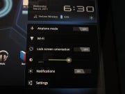
Notifications Display

Here's another dramatic interface improvement. Tap once, and up pop notifications, plus an expanded version of the one-line status update on the bottom of the screen. Clearly visible are the network and battery life (with the percentage remaining), not to mention the date and time. Tap again to reveal easy access to the airplane-mode switch, a Wi-Fi settings shortcut, the lock screen orientation button, the notifications enabler, and the brightness controls. You also get a direct shortcut to the settings panel. Overall the design provides clean, easy access, with a visual presentation. It's a huge win for users.

Improved Native Keyboard

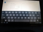
The key layout and overall responsiveness of the keyboard (as implemented on the Xoom) is dramatically improved over other implementations. Sure, I wish it had adjustable size and a numeric row (as on HP's still-to-be-released WebOS-based TouchPad), but the keys are better shaped and better organized than what I've seen on tablets using Froyo. Large Backspace and Enter buttons, a dedicated .com button in the Web browser keyboard, even a one-touch button for voice input--my fingers can fly over this device.

Widgets: Bringing Data Alive

The current widgets selection is, I hope, just the beginning; widgets open a whole new world of usability and access to your data. Some of them annoy: To be honest, I couldn't care less about the most popular/discussed/featured YouTube videos. But the flip-book-style approach is catchy and finger-friendly, and I hope we get widgets for, say, the most recent updates to your favorite YouTube channels. Likewise, the easy-access flip-style approach to Books could be superhot if applied to a widget for newspapers and magazine subscriptions, for example. Other preinstalled widgets include those for bookmarks, the calendar, contacts, an analog clock, e-mail and Gmail, Google search, the Android Market, music, and a picture frame.
The thing about widgets is that they make the tablet feel organic. They can have real-time data updates, and you scroll around within them without first launching a given app. The push approach--that is, having data pushed to you rather than your needing to seek data out--has always had particular appeal. I just hope that users can get more widgets, and more customization around them as Honeycomb matures. After all, Honeycomb has six home screens to fill.

Soft-Touch Navigation Buttons

The buttons are context sensitive, yet consistent in their placement. They sit within the screen display, which has the bonus of being able to rotate and be positioned relative to any orientation the user holds the tablet in. Admittedly, I don't like the subtlety of the back button (it looks more like a bookmark than a back button), nor do I get the icon for the 'multitasking' replacement for the six most-recently used apps. And there is some risk of confusion in that users might miss the very subtle cues (dots or other graphical bits) to tap for more menu options--especially since different apps seem to have different context-sensitive options available (judging from the menus that popped up in the random and small selection of apps I've tried so far). But those are quibbles that may yet be addressed by design tweaks down the road. On the whole, navigation is clearly improved.


Saturday, February 12, 2011

Samsung Google Nexus S review: Royal droid


Another year, another heir to the Droid throne – and Google are trying to be democratic about it. Which is a roundabout way of saying they’re not monogamous. For the Nexus One, Google teamed up with HTC. This time around, they trusted Samsung to do the job, using the Galaxy S as a base.
  
Google Nexus S official photos
It’s only their second try and users are given a second chance to like the Royal Droid. A tall task it is – the very concept is fundamentally incompatible with the free and open source Android system. Royal blood is not a benefit in a free democracy. Google did learn it the hard way with the Nexus One.
Google’s second smartphone child has more than just an image problem to tackle. The Samsung Google Nexus S has to keep pace with the evolution of the platform. The “S” in the name may stand for many things – from second to superior. But with Android 2.3 Gingerbread inside, speed is not far from the truth either. Here’s what else the Nexus S has to offer in a nutshell.

Key features:

  • Quad-band GSM and tri-band 3G support
  • HSDPA, 7.2 Mbps; HSUPA, 5.76 Mbps
  • 4.0" WVGA (480x800) Super AMOLED Contour Display with curved glass screen
  • Android OS, v2.3 Gingerbread
  • 1 GHz ARM Cortex-A8 (Hummingbird) processor
  • 16GB storage, 512 MB RAM
  • 5 MP autofocus camera with LED flash and geotagging
  • Front-facing VGA camera
  • Wi-Fi b/g/n with DLNA
  • GPS with A-GPS
  • Portable Wi-Fi hotspot and stereo Bluetooth v2.1
  • Near Field Communication chip
  • Accelerometer, proximity and light sensors
  • Standard 3.5 mm audio jack
  • microUSB port (charging)
  • Adobe Flash support out of the box
  • Latest Google Mobile apps

Main disadvantages:

  • No microSD slot
  • No 720p video recording
  • All-plastic body, fingerprint magnet
  • No DivX and XviD support (no actual video player) out of the box
  • No dedicated camera key and no lens cover
  • No FM radio
  • No smart dialing
  • Overly expensive for its feature set